My first babysteps in static code analysis with nDepend
 A few weeks ago, I was asked to look into static code analysis, mainly with the tool
nDepend. I’ve never had any experience with static code analysis, and was fairly
curious about what this was all about.
A few weeks ago, I was asked to look into static code analysis, mainly with the tool
nDepend. I’ve never had any experience with static code analysis, and was fairly
curious about what this was all about.
In this blogpost I will be talking about what static code analysis is, what the difference is with dynamic code analysis and when to use it. After that I will be covering some metrics and conclusions you can get from a static code analysis tool and I will be ending my post with a small overview of what nDepend has to offer.
Static code analysis
What is it?
You might not know it, but in most IDE’s we already use static code analysis all the time. However it is wrapped into a nice package known as IDE features.
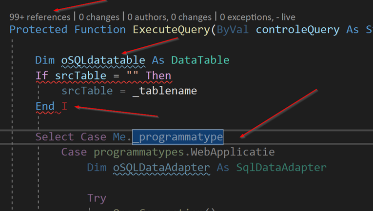
As you can see in the image above, I can get 4 kinds of static code analysis from this little snippet of code in Visual Studio alone.
- On top we have codelens, informing us how many times and where the function is used
- The blue squiggly line indicates we have a local variable that does not comply to the local naming conventions
- The red squiggly line indicates we should expect a build error on that line
- The slightly dimmed code below tells us that code is currently unreacheable
Static vs Dynamic code analysis
We can define the difference between static and dynamic code analysis as follows:
| Static code analysis | Dynamic code analysis |
|---|---|
| Code is not running | Code is in a running state |
| Analysing code itself | Analysing features |
| For obvious problems & code smells | For everything else |
| Examples: Code style & smells, metrics, … | Examples: Memory & CPU pressure, debugging, … |
In short: Static code analysis focusses mostly on code quality in the domain of maintainability & readability. Dynamic code analysis focusses on features and performance.
Static code metrics
In this chapter I will focus on the four metrics I think are the most important ones for your code. I might blog about some new metrics later, but in my humble opinion these are key for your code.
Cyclomatic Complexity
Quite a mouthful as a word. When this metric is measured, it will count every if, else, switch, goto, for, while and every other known code-flow-changing keyword. This count results in
the Cyclomatic Complexity.
To make it a little easier to understand: Cyclomatic complexity measures the amount of code paths in a method.
It is a good practice to keep your complexity under 10. Methods between 10 and 20 can exists but should be rather rare. Methods with a complexity of 20 and above should be refactored on the earliest convenience.
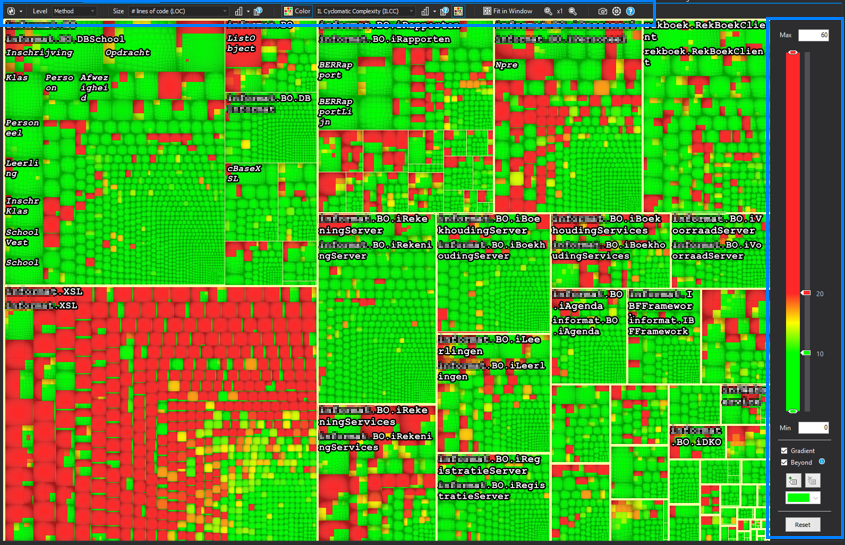
When you request the metric to be displayed, it shows up like this:

The first time I saw this one, I was like: what am I looking at? Ain’t nobody can read that. But I got it figured out, and this is how it works:
Reading an nDpend metrics chart
Settings on top and to the right
On the top you will find the following:
| Item | What it controls |
|---|---|
| Level | The smallest part of the chart you will see, and subsequently the metrics that are available |
| Size | The metric controlling the size of the boxes |
| Color | The metric controlling the color of the boxes |
On the right you will find a slider and some minor settings, controlling what level
of the Color-selected-metric correspondents with what color.
Boxes, boxes, boxes

Inside the blue square you see the biggest kind of box in the graph. Surrounded by a thick yellow line (remember: never eat yellow lines) you will find all code within an assembly.
For this example specifically, the size setting has been set to lines of code.
This means the size of the box represents the amount of lines in the code, relative
to all lines of code in the solution.

This time the blue square surrounds a namespace. It’s not so clear to see, but the namespace is being surrounded by a thin, non-edible yellow line. The size is again a representation of the amount of lines of code.
The next step in this graph is evidently a class. They are found by looking at the slightly darker borders making a square. And you guessed it correctly, again the size is dependant on the lines of code.

The final and smallest part in the chart is a method. They should be hard to see in an overview this large, but this particulary codebase has some big (read: huge) methods.
All these levels together give you a nice overview on how the distribution of lines of code is in your solution.
Color
Going back to the cyclomatic complexity graph without any blue boxes. When we look at the colour settings you see that I have selected the “IL Cyclomatic Complexity” as a metric for the color metrics. On the left you can see that I’ve set the green bar at 10 and the red bar at 20.
This results in all methods having a complexity equal or less than 10 to be green. Methods with a complexity between 10 and 20 are a shade of green, yellow or red-ish. All methods above 20 are red in this example. As you can see there are quite some complex methods in the system, with the bulk of them on the bottom left corner in the XSL assembly.
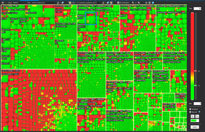
Diving to your method
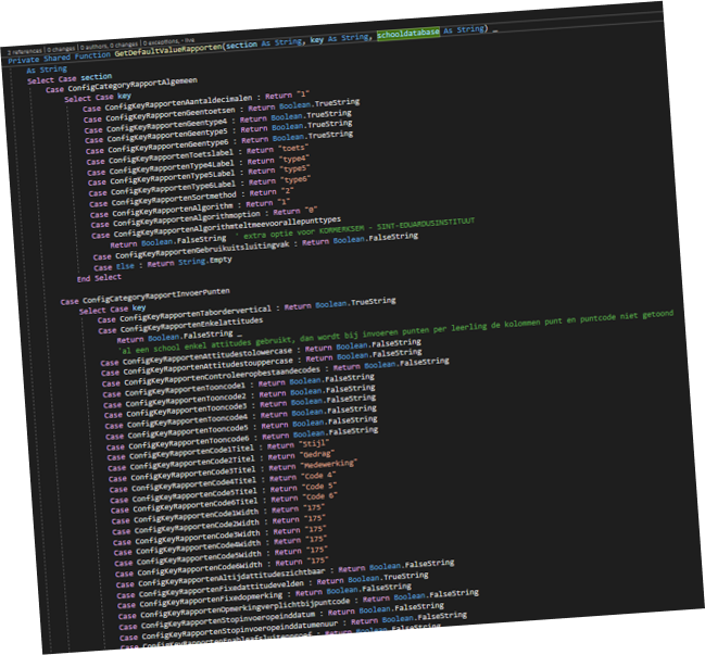
Whenever you click a “box” in the graph, you get redirected to the method representing that box. The example above has a cyclomatic complexity of 723 (only part of the method is displayed here, the full method is around 500 lines long).
Lines of code
The first rule of functions is that they should be small. The second rule of functions is that they should be smaller than that.
“Uncle Bob” - Robert C. Martin
Uncle bob also specifies some numbers regarding this. However he does state that these numbers are based only on his gutfeeling and his experience. He states that functions should not be a 100 lines long. In fact they should hardly be 20 lines long.
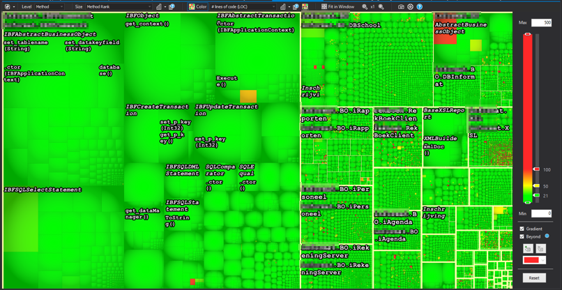
This is the same codebase as the previous example. However the size of the boxes is dependent on it’s rank now. Rank is a metric based on the Google Rank system where methods and classes that are used more, are bigger, and the least used are the smallest. The color represents the number of lines of code. From this metric you can see that the code ranked highest is actually not that bad in regards of lines of code. Almost all of them are beneath 20 lines of code, a few are above 50 and some rare ones are above 100.
Instability vs abstractness
This is actually a metric in the scope of the assembly. It produces a nice graph where you can get some meaningfull insights very quick. But first I need to introduce you to stability and abstractness themselves.
Stability
In the context of code analysis, stability means how stable code should be, and not how stable code really is. You can also describe stability as “how difficult and risky is it to change something about this code”.
When talking about stability, it actually boils down to this: if something in your code is referenced a lot, it is hard to change. Ever tried removing a parameter in a method referenced 100 times? That method is stable code.
When talking about assemblies, stable assemblies mean that this particular assembly has lots of incoming references.
Abstractness
Abstractness is a bit easier to explain: it’s a number between 0 and 1. A zero means the assembly contains only implementations. An assembly gets rewared a 1 when all the types within the assembly are only interfaces or abstract classes.
Stability vs Abstractness
Combining the two together, you can get the following graph:
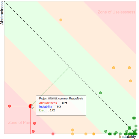
When designing your application, you have to keep instability and abstractness in mind. A well designed appliction will have stable abstract types and unstable implementations of those types. Combining these two gives you the best chance of creating maintainable code. This is however theroretical, and the image above shows you how well your code behaves in this aspect.
In the middle you have the green zone. This is the place you want your assembly to be. It goes from the fully abstract stable assemblies in the top left to the unstable but implemented zone on the bottom right.
Next to the green zone you will find the orange “Danger zones”. These are assemblies that are moving in the wrong direction, but are not that bad (yet).
In the top right corner you will find the “Zone of Uselessness”. Assemblies ending up here are abstractions that are not very usefull. For example: An assembly with all kinds of interfaces but those interfaces are used only in one other assembly.
The bottom right corner is the worst place to find your assembly in. The “Zone of Pain” is the place where you have code that is referenced a lot, but all are implementations instead of abstractions. The zone of pain is the place where you find yourself in fixing a bug because of a code change you did not expect to affect that many things.
The main thing you are measuring here is if your software depends on interfaces instead of implementations. Having this balance in order makes your life a lot easier.
Coupling & Cohesion
When designing software, you should take the following into account:
Software should have low coupling and high cohesion
But what does this actually mean?
Coupling
Methods and classes are coupled when one uses a part of the other. For example when you have a line of code in your class doing this:
var test = new DateTime(2019, 01, 01);
Your class is now coupled with the DateTime object. Any changes to the DateTime object will reflect changes in your code, and this could break your code. Thankfully the DateTime object is a very stable .net framework object that is very unlikely to change.
In your own code however you want your classes to be coupled to very little other classes. It’s much better to be coupled to an interface than an implementation. (see SOLID principles).
When measuring coupling from a certain class, there are 2 types:
- Afferent coupling: number of entities (methods/classes/assemblies) that are dependend on this entity
- Efferent coupling: number of entities (methods/classes/assemblies) that this entity depends upon
In both cases, you want that number to be as low as possible to keep your maintainability as high as possible.
Cohesion
A class is cohesive if everything that the class needs to do its job exists within the class. This is a very hard thing to measure, so they made a metric that might do the trick a bit.
The LCOM (Lack of cohesion) is a number between 0 and 1. A class containing only methods using all of the internal fields gets rewarded with a nice 0. When none of the methods in the class use any of the internal fields, it gets a nice 1.
A result below 0.5 is considered a good result. Above 0.7 there might be a small problem and above 0.8 you’re not very cohesive. Keep this number as low as possible as well.
Coupling & Cohesion together
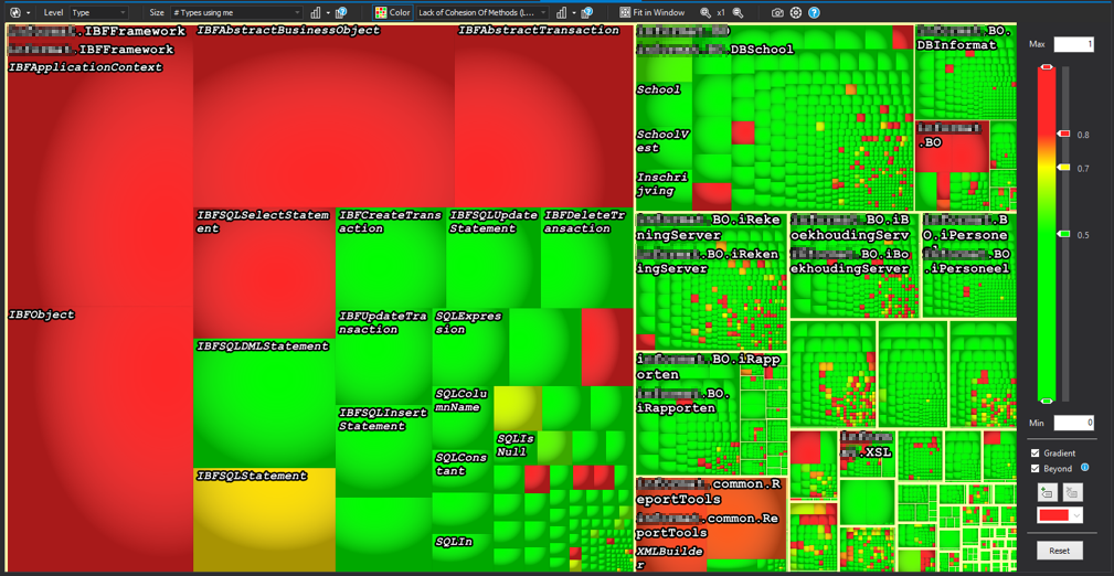
This time the box size is the amount of types using the specific class. The color is the lack of cohesion of the methods in that class. The class on the top left could be a class that is badly designed, because it’s functionality is not contained within the specific class.
nDepend added values
For the creation of this blog, I’ve been using nDepend. nDepend is a tool, integrated in Visual Studio or integrated in the buildserver, that can be used for much more than what I’ve described here.
More data
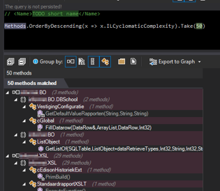
All the data of your code is being stored in nDepend and can be queried via linq queries. This gives you the ability to quickly query your code. In the example I query the code, requesting the top 50 methods with the highest Cyclomatic Complexity.
Rules
However, you can do more: from these queries you are able to create rules. For example, you can create a rule that enforces all methods containing more than 100 lines of code to have a cyclomatic complexity of maximum 10 or the method name to not contain your first name.
You can also define rules as critical, this is particulary of use if you use the build server integration.
Build Server step
When you configure nDepend as a build step in your pipeline, you can get a nice graph and overview of how your code is evolving over time. You can detect pitfalls and bad code practices earlier, when it is still easy to overcome them.
The coolest thing however is when you integrate the build server in a setup with critical rules, these are really enforced. Breaking a critical rule in your code will trigger a build step failure and will stop that code from ever entering production.
Final thoughts
When I was first asked to venture on a journey through static code analysis, I had no idea what to expect. Even after the first two hours of looking at the charts, data and controls, it had me confused. After a while I got the hang of it and now I really see the added benefits of having static code analysis.
- It enables you to find code smells and potential errors
- It enables you to get to know code you have never seen before
- It enables you and other developers to get to know best practices
- It enables you to have control about the amount of “bad code” you allow in the software
nDepend can be a real help here. There are other products on the market, even free ones but I have no experience with those. Maybe later?
